Every memorable website has something that instantly feels right. Before users read a headline or explore a product, they experience a visual impression that shapes their perception of the brand. At the center of that impression is color. A cohesive brand color system is not just a design choice—it is the foundation of identity, recognition, and trust in the digital space. When colors are inconsistent or poorly structured, a website can feel disjointed and unprofessional. Users may struggle to understand where to focus, what actions to take, or even what the brand stands for. On the other hand, a cohesive color system creates harmony. It guides attention, reinforces messaging, and ensures that every page feels like part of a unified experience.
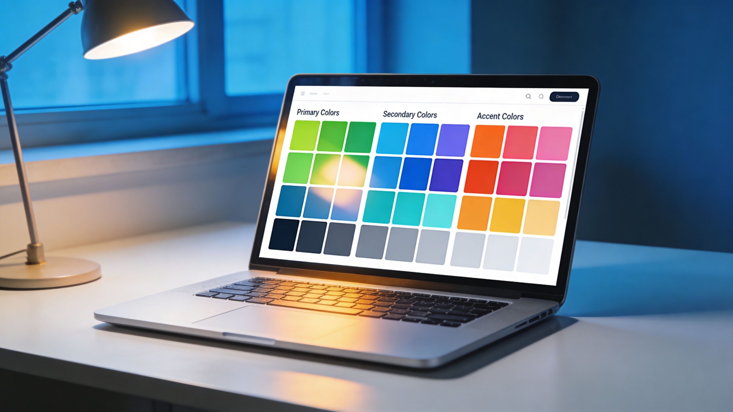
A: Most strong systems start small, often with one primary color, one or two supporting colors, one accent, and a neutral set.
A: A brand color supports overall identity, while an accent color is usually reserved for emphasis and action moments.
A: Yes, neutrals help your brighter colors stand out and keep the site readable and balanced.
A: No, a cohesive system works because not every color appears everywhere—each one has a role.
A: Start by standardizing your core colors, defining roles, and using the same button, text, and surface rules across the site.
A: Yes, as long as they are balanced with strong neutrals and used intentionally rather than everywhere at once.
A: Choosing colors they like visually without assigning clear roles for how those colors should function.
A: Usually yes—success, warning, and error states are easier to understand when they are visually distinct and consistent.
A: Yes, testing key templates and real UI states helps reveal contrast, consistency, and hierarchy problems early.
A: Clear roles, consistent usage, readable contrast, emotional fit with the brand, and enough flexibility to scale across the whole site.
The Psychology Behind Color and Brand Perception
Color is one of the fastest ways to communicate emotion and meaning. Within milliseconds, users form opinions about a brand based on its color palette. These reactions are often subconscious, yet they play a critical role in shaping trust and credibility.
Different colors evoke different emotional responses. Blue often communicates stability and reliability, making it a popular choice for technology and finance brands. Green is associated with growth, balance, and health, frequently used in wellness and sustainability-focused industries. Red conveys urgency and energy, while black suggests sophistication and authority.
However, these associations are not absolute. Context, cultural background, and industry norms all influence how colors are perceived. A luxury brand may use black to signal exclusivity, while a fitness brand might use the same color to convey strength and intensity.
Understanding color psychology allows you to align your palette with your brand’s personality. If your brand aims to feel approachable and friendly, softer tones and warmer hues may be more effective. If your goal is to appear innovative and cutting-edge, bold contrasts and modern color combinations can help achieve that perception.
A cohesive color system begins with clarity about what your brand represents and how you want users to feel when they interact with your website.
Defining Your Core Brand Colors with Purpose
At the heart of every color system are the core brand colors. These are the primary hues that define your identity and appear consistently across your website and marketing materials. Choosing these colors should be a deliberate process rooted in strategy rather than preference.
Start by identifying one dominant color that represents your brand. This color will be the most recognizable element of your visual identity and should align closely with your brand values. It will often appear in your logo, navigation elements, and key design features.
Next, select one or two supporting colors that complement your primary color. These secondary colors add depth and flexibility to your design while maintaining visual harmony. They should work seamlessly with your primary color without competing for attention.
Finally, consider neutral tones such as white, gray, or black. These colors provide balance and ensure that your design does not become overwhelming. They also improve readability and create space for content to stand out.
The goal is to create a palette that feels cohesive and intentional. Each color should have a defined role, contributing to a unified visual language that users can easily recognize and navigate.
Building a Structured Color Hierarchy for Clarity
A cohesive color system is not just about which colors you choose, but how you organize and apply them. This is where a structured color hierarchy becomes essential. A clear hierarchy ensures that users can quickly understand what elements are important and how to interact with your website.
Primary colors are typically used for the most prominent elements, such as headers, navigation bars, and branding components. These colors establish the overall tone and identity of the site.
Secondary colors are used to support the primary color and create visual variety. They may appear in section backgrounds, illustrations, or secondary buttons. Their role is to enhance the design without distracting from the main message.
Accent colors are reserved for key actions and highlights. These are often used for call-to-action buttons, links, and important notifications. Because they are used sparingly, they stand out and draw attention where it matters most.
Neutral colors provide the foundation for readability and structure. They are used for backgrounds, text, and spacing, ensuring that content remains clear and accessible.
By assigning specific roles to each color, you create consistency across your website. Users learn to associate certain colors with specific actions or meanings, making navigation more intuitive and reducing cognitive load.
Creating Consistency Across Every Page and Element
Consistency is what transforms a collection of colors into a cohesive system. Without it, even the most well-chosen palette can feel chaotic. Every page, component, and interaction should follow the same color rules to create a seamless experience.
This means using your primary color consistently for branding elements, applying accent colors uniformly for calls-to-action, and maintaining the same background and text color combinations throughout the site. Even small inconsistencies, such as slightly different shades of the same color, can disrupt the visual flow.
Design systems and style guides play a crucial role in maintaining this consistency. By documenting your color palette, usage rules, and examples, you ensure that everyone involved in the design and development process follows the same guidelines.
Consistency also extends to interactive states. Buttons, links, and hover effects should follow predictable patterns. When users see a specific color change on hover, they should immediately understand that the element is clickable.
A cohesive color system creates familiarity. As users navigate your website, they become more comfortable and confident, which increases engagement and encourages action.
Designing for Accessibility and Readability
A visually appealing color system is only effective if it is accessible to all users. Accessibility is not just a technical requirement—it is a fundamental aspect of good design. Ensuring that your color choices are readable and inclusive can significantly improve user experience and conversion rates.
Contrast is one of the most important factors in accessibility. Text should have sufficient contrast against its background to be easily readable. Low-contrast combinations may look stylish but can make content difficult to read, especially for users with visual impairments.
Color should not be the only way to convey information. For example, relying solely on color to indicate errors or success states can exclude users who have color vision deficiencies. Combining color with text or icons ensures that the message is clear to everyone.
Testing your color system across different devices and lighting conditions is also essential. Colors can appear differently on various screens, and what looks good in one environment may not work in another.
By prioritizing accessibility, you create a more inclusive experience that benefits all users. It also demonstrates professionalism and attention to detail, reinforcing trust in your brand.
Adapting Your Color System for Different Contexts
A cohesive brand color system must be flexible enough to adapt to different contexts while maintaining consistency. Your website may include various sections, such as landing pages, product pages, and blog content, each with its own purpose and tone.
While the core palette remains the same, you can adjust the balance of colors to suit different contexts. For example, a landing page focused on conversions may use more accent colors to highlight calls-to-action, while a blog page may rely more on neutral tones for readability.
Seasonal campaigns, promotions, and special events may also require temporary adjustments to your color system. These changes should still align with your core palette to ensure that the brand identity remains intact.
Dark mode is another important consideration. Many users prefer darker interfaces, and adapting your color system for dark mode can enhance user experience. This involves adjusting background and text colors while maintaining contrast and readability.
Flexibility allows your color system to evolve without losing its identity. It ensures that your website remains dynamic and engaging while staying true to your brand.
Bringing It All Together: Crafting a Visual Identity That Lasts
Creating a cohesive brand color system is both an art and a science. It requires creativity to design a palette that captures your brand’s essence, and strategy to apply it in a way that enhances usability and drives results. When done effectively, a cohesive color system becomes a powerful asset. It strengthens brand recognition, improves user experience, and supports conversion goals. It turns your website into a unified, polished environment where every element works together seamlessly. As you develop your color system, focus on intention. Every color should have a purpose, every combination should serve a function, and every application should reinforce your brand identity. This level of clarity transforms design from decoration into communication. In the competitive digital landscape, details matter. A cohesive color system is one of those details that can set your website apart. It creates a lasting impression, builds trust, and guides users toward meaningful interactions. By investing in a thoughtful, well-structured color system, you are not just improving your website’s appearance—you are building a foundation for long-term success and growth.