Every website visitor believes they are making rational decisions. They compare prices, evaluate features, and scan content for value. But beneath that surface lies a powerful, often unnoticed force shaping every action they take: color. Color is not decoration. It is communication. It signals emotion, builds trust, and subtly directs attention in ways that words alone cannot achieve. In the digital world, where attention spans are measured in seconds, color becomes one of the fastest ways to influence perception. Before a visitor reads a headline or processes a value proposition, they have already formed an impression based on visual cues. That impression can determine whether they stay, explore, and convert—or leave immediately.
A: There is no universal best color—conversion usually depends on contrast, audience expectations, and how clearly the action stands out.
A: Not always; the best CTA color is the one that stands out within your specific palette while still fitting the brand experience.
A: Blue often feels reliable and calm, but trust also depends on design quality, messaging, reviews, and overall brand presentation.
A: Yes, too many competing colors can weaken hierarchy, distract users, and make decisions feel less obvious.
A: Usually a small, controlled palette works best, with clear roles for brand colors, neutrals, and one primary accent.
A: Not necessarily—different business models and user journeys often need different emotional tones and interface priorities.
A: No, it works best alongside good copy, layout, offer design, usability, and trust signals.
A: Review your contrast, user behavior, click patterns, and A/B test key pages when possible.
A: Usually start by improving hierarchy, CTA visibility, and contrast before making a full palette overhaul.
A: A clear palette, strong contrast, purposeful accent use, accessible design, and colors that support both trust and action.
How Color Shapes Human Behavior Online
Color works on both a conscious and subconscious level. At a conscious level, users may associate certain colors with brands or industries. At a subconscious level, color triggers emotional and psychological responses rooted in biology and cultural conditioning.
Warm colors like red, orange, and yellow tend to stimulate energy and urgency. Cool colors like blue and green create a sense of calm, trust, and stability. Neutral tones such as black, white, and gray provide balance and sophistication. These reactions happen instantly, often before users are aware of them.
On a website, these emotional responses influence how users navigate and interact. A bold red call-to-action can create urgency and encourage immediate clicks. A calming blue background can make users feel secure enough to complete a purchase. A minimalist black-and-white design can signal luxury and exclusivity.
Behavioral psychology shows that decisions are often driven by emotion first, followed by rational justification. This means your color choices are not just aesthetic decisions—they are conversion tools. When aligned with user expectations and brand identity, color can guide users seamlessly from curiosity to action.
The Emotional Language of Key Website Colors
Each color carries its own set of associations, and understanding these can help you craft a more effective visual strategy. However, context matters. The same color can evoke different emotions depending on how it is used, combined, and presented.
Red is one of the most powerful and attention-grabbing colors. It conveys urgency, passion, and excitement. It is often used for sales, limited-time offers, and high-impact calls-to-action. However, overuse can create stress or overwhelm, so it is best applied strategically.
Blue is widely associated with trust, reliability, and professionalism. It is a popular choice for financial institutions, tech companies, and healthcare websites because it reassures users and reduces perceived risk. Blue backgrounds and accents can create a calm browsing experience that encourages longer engagement.
Green is linked to growth, health, and positivity. It is commonly used in wellness, sustainability, and finance-related websites. Green can also signal “go” or progress, making it effective for buttons and confirmation states.
Yellow evokes optimism and energy but can be overwhelming if used excessively. It works well as an accent color to draw attention without dominating the interface. When paired with darker tones, it can create strong visual contrast.
Black represents sophistication, luxury, and authority. It is often used in high-end branding and minimalist designs. Black backgrounds with high-contrast typography can create a premium feel that appeals to certain audiences.
White symbolizes simplicity, cleanliness, and clarity. It is essential for creating space and improving readability. White space is not empty—it is a design tool that enhances focus and reduces cognitive load.
Understanding these emotional signals allows you to build a cohesive palette that aligns with your brand message and user expectations.
Building a Conversion-Focused Color Palette
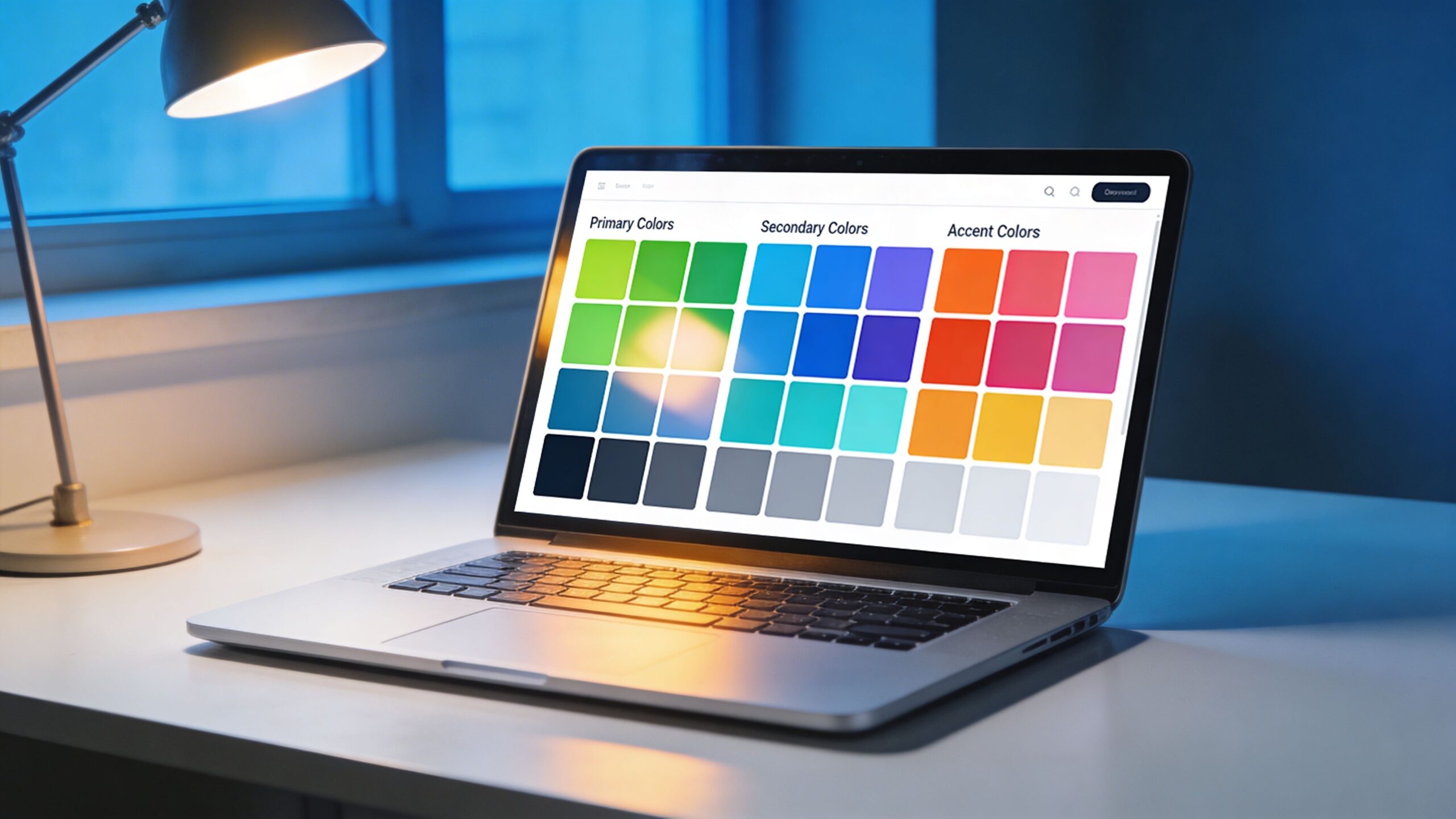
A successful website does not rely on a single color. It uses a carefully structured palette that balances primary, secondary, and accent colors. Each plays a specific role in guiding the user experience.
The primary color defines your brand identity. It is the color users associate with your business and should be used consistently across key elements such as headers, navigation, and branding assets. This color sets the emotional tone of your website.
Secondary colors support the primary color and add depth to the design. They are used for backgrounds, sections, and supporting elements. A well-chosen secondary palette creates visual harmony and prevents the design from feeling flat.
Accent colors are the most critical for conversions. These are used sparingly to highlight important actions, such as buttons, links, and key messages. The goal is to create contrast that naturally draws the user’s eye.
Contrast is one of the most important principles in color psychology. Without sufficient contrast, users may struggle to identify interactive elements. A high-contrast call-to-action stands out clearly and increases the likelihood of clicks.
Consistency is equally important. When users learn that a certain color represents an action, such as a green button for “continue,” they begin to navigate more intuitively. Inconsistent use of color can create confusion and reduce trust.
A well-structured palette ensures that every color has a purpose. It creates a visual hierarchy that guides users effortlessly through the site.
Designing High-Converting Calls-to-Action
Calls-to-action are where color psychology directly impacts conversions. These elements are the tipping point between browsing and taking action, and their design must be intentional.
The color of a call-to-action button should contrast strongly with the surrounding elements. This makes it immediately visible and easy to identify. If your website uses a predominantly blue palette, a contrasting color like orange or green can make the button stand out.
However, contrast alone is not enough. The color must also align with the emotional intent of the action. A red button can create urgency for a limited-time offer, while a green button can signal a positive, low-risk action such as signing up or proceeding.
Placement and repetition also play a role. When users encounter the same button color consistently across the site, they begin to associate it with action. This familiarity reduces friction and increases the likelihood of conversion.
Testing different color variations can reveal surprising insights. In some cases, a small change in hue or saturation can lead to significant improvements in click-through rates. This is why data-driven experimentation is essential in optimizing color for conversions.
Ultimately, the goal is to make the desired action feel obvious and effortless. The right color can remove hesitation and guide users toward the next step.
Cultural and Contextual Considerations in Color Choice
Color meanings are not universal. Cultural differences can influence how colors are perceived and interpreted. For example, while white is associated with purity and simplicity in many Western cultures, it can symbolize mourning in some Eastern cultures.
Similarly, red can represent excitement and urgency in one context, but danger or warning in another. These variations highlight the importance of understanding your target audience and their cultural background.
Industry context also plays a role. Certain colors have become standard within specific sectors. Blue is common in finance and technology because it conveys trust. Green is prevalent in health and sustainability because it represents growth and well-being.
Breaking these conventions can help your brand stand out, but it must be done carefully. If your color choices conflict with user expectations, it can create confusion or reduce credibility.
Localization is another factor to consider. If your website serves a global audience, adapting color schemes for different regions can improve user experience and engagement.
By considering both cultural and contextual factors, you can create a color strategy that resonates with your audience and supports your conversion goals.
The Role of Color in Branding and Trust
Trust is one of the most important factors in online conversions. Users are more likely to engage with a website that feels credible, professional, and consistent. Color plays a central role in building that trust.
A cohesive color scheme reinforces brand identity and creates a sense of familiarity. When users encounter consistent colors across your website, social media, and marketing materials, it strengthens recognition and credibility.
Inconsistent or poorly chosen colors can have the opposite effect. Clashing colors, low contrast, or overly aggressive palettes can make a website feel unprofessional or difficult to navigate.
Color also influences perceived value. A refined, balanced palette can elevate the perceived quality of your product or service. This is why luxury brands often use restrained color schemes with strong contrast and minimal distractions.
Trust is built through repetition and consistency. When users feel comfortable and confident in your design, they are more likely to take action. Color is one of the fastest ways to establish that comfort.
Testing, Optimization, and Continuous Improvement
Color psychology is powerful, but it is not a one-size-fits-all solution. What works for one audience or industry may not work for another. This is why testing is essential.
A/B testing allows you to compare different color variations and measure their impact on user behavior. By testing elements such as button colors, background tones, and accent highlights, you can identify what resonates most with your audience.
Analytics tools can provide valuable insights into how users interact with your website. Metrics such as click-through rates, bounce rates, and conversion rates can reveal the effectiveness of your color strategy.
It is important to approach testing with a clear hypothesis. Instead of randomly changing colors, focus on specific goals, such as increasing button visibility or improving readability. This ensures that your experiments produce meaningful results.
Optimization is an ongoing process. As user preferences evolve and design trends change, your color strategy should adapt accordingly. Regular testing and refinement help you stay aligned with user expectations and maintain high conversion performance.
Crafting a Visual Experience That Converts
Website color psychology is not about following rigid rules. It is about understanding human behavior and using that knowledge to create meaningful, effective designs. When color is used intentionally, it becomes a powerful tool for guiding users, building trust, and driving action. The most successful websites are those that create a seamless visual experience. Every color choice supports a purpose, from establishing brand identity to highlighting key actions. This clarity reduces friction and makes the user journey intuitive. As you refine your website, consider how each color contributes to the overall experience. Does it enhance readability? Does it guide attention? Does it align with your brand message? These questions help ensure that your design is not only visually appealing but also strategically effective. In a world where competition is just a click away, small details can make a significant difference. Color is one of those details. When used thoughtfully, it can transform your website from a static interface into a dynamic, conversion-driven experience that resonates with users and inspires action.