The moment a user lands on a website, a silent evaluation begins. Before a single word is read or a button is clicked, the brain processes visual information and forms an immediate impression. At the center of that impression is color. It sets the tone, communicates emotion, and shapes expectations within seconds. In web design, user experience is often associated with navigation, layout, and functionality. While those elements are essential, color operates on a deeper level. It influences how users feel, how they interpret information, and how they behave. A well-executed color strategy can make a website feel intuitive and inviting, while poor color choices can create confusion and friction. Understanding how color impacts user experience is not just about aesthetics. It is about creating an environment where users feel comfortable, engaged, and confident enough to take action. When color is used intentionally, it becomes a powerful tool for guiding attention, enhancing usability, and driving meaningful interactions.
A: Because it shapes first impressions, guides attention, improves readability, and helps users understand how the interface works.
A: Yes, weak contrast, inconsistent usage, or overly intense palettes can make a website harder to read, trust, and navigate.
A: No, the best choice depends on brand goals, audience expectations, content type, and how the colors function together.
A: Not automatically—they work best when the surrounding page is calm enough to let them stand out clearly.
A: They create balance, reduce clutter, and give key actions and messages more room to stand out.
A: The system should stay consistent, but the emphasis can shift depending on the page goal and content priority.
A: Using color mainly for style without defining how it helps users understand and navigate the page.
A: Absolutely—if users cannot read or interpret the interface easily, the overall experience suffers immediately.
A: Start by improving contrast, simplifying the palette, and making your main actions more visually distinct.
A: Clear hierarchy, readable contrast, consistent meaning, emotional fit, and color choices that make the website easier to use.
The Emotional Blueprint of Color in Digital Spaces
Color is one of the most immediate ways to evoke emotion. Different hues trigger different psychological responses, and these responses influence how users perceive a website. This emotional layer plays a crucial role in shaping user experience.
Warm colors such as red, orange, and yellow tend to create energy and urgency. They can make a website feel dynamic and exciting, encouraging quick decisions and immediate action. Cool colors like blue and green, on the other hand, promote calmness and trust. They are often used in industries where reliability and security are essential.
Neutral tones provide balance and structure. White space enhances clarity and readability, while darker tones can add depth and sophistication. The combination of these elements creates a visual language that users interpret instinctively.
The emotional impact of color is not isolated. It interacts with content, imagery, and layout to form a cohesive experience. A bright, energetic palette paired with minimal content may feel overwhelming, while the same colors used strategically can create a sense of momentum and engagement.
Designing with emotion in mind allows you to shape how users feel throughout their journey. This emotional connection is a key factor in whether users stay, explore, and ultimately convert.
Guiding Attention Through Strategic Color Placement
One of the most important roles of color in user experience is directing attention. In a digital environment filled with information, users rely on visual cues to navigate and prioritize what matters.
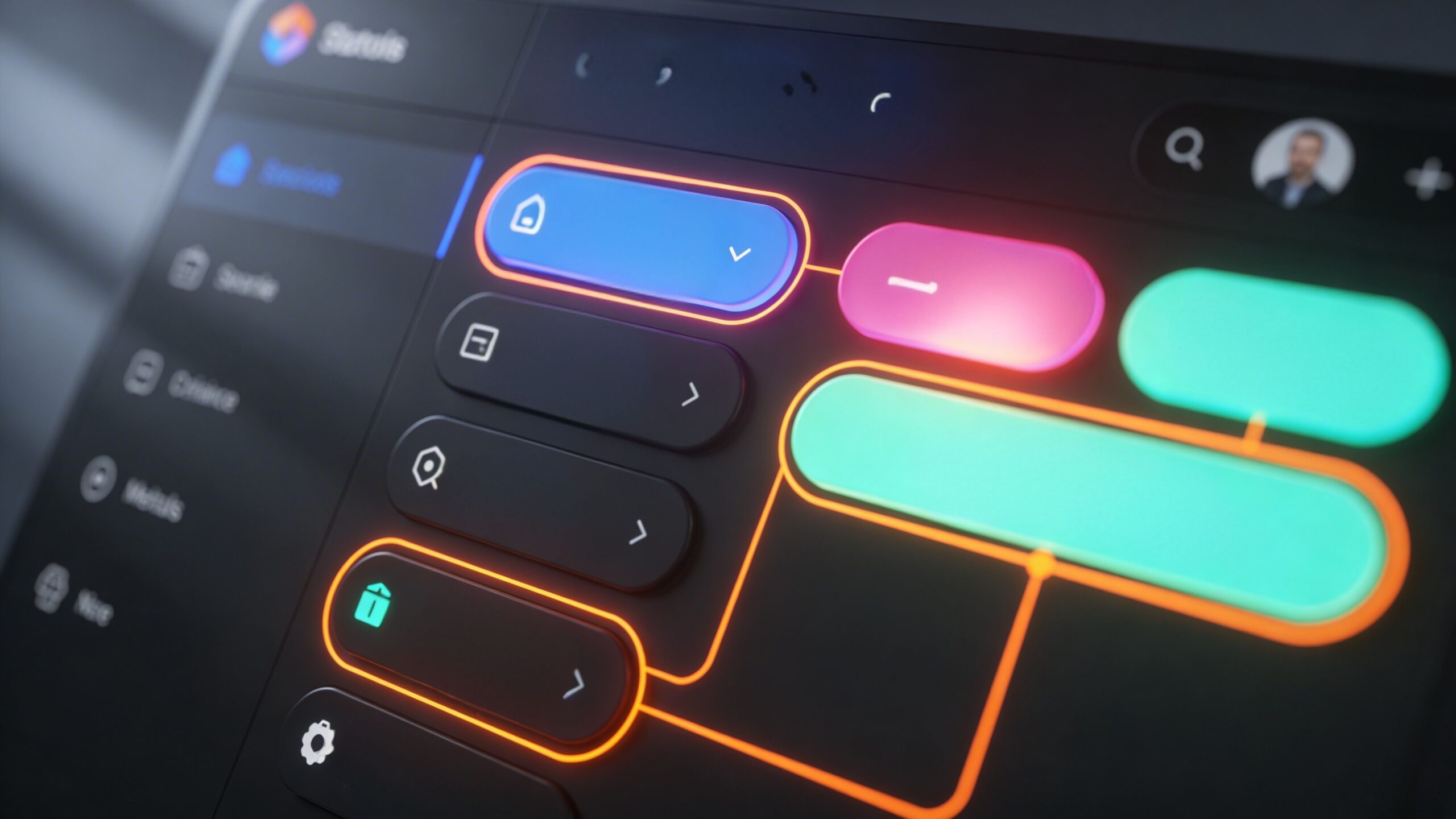
Color creates hierarchy. It tells users where to look first, what to focus on next, and which elements require action. A bold, contrasting color can highlight a call-to-action, making it stand out from the rest of the interface. Subtle variations in color can differentiate sections, helping users understand the structure of the page.
Without clear visual hierarchy, users may feel lost or overwhelmed. They may struggle to identify important elements or miss key actions altogether. This leads to frustration and increased bounce rates.
Strategic use of color simplifies the user journey. It reduces cognitive load by making decisions easier. When users can quickly identify where to click or what to read, their experience becomes smoother and more enjoyable.
Effective color placement is not about adding more color. It is about using contrast and consistency to create clarity. The goal is to guide users effortlessly from one step to the next.
Enhancing Readability and Accessibility with Color
User experience is closely tied to how easily users can consume content. Color plays a critical role in readability and accessibility, directly affecting how users interact with text and information.
Contrast is the foundation of readability. Text must stand out clearly against its background to be easily legible. Low contrast combinations, such as light gray text on a white background, can strain the eyes and discourage users from engaging with content.
Accessibility goes beyond basic readability. Users with visual impairments or color vision deficiencies may experience websites differently. Designing with accessibility in mind ensures that your website is usable for a wider audience.
Color should not be the sole method of conveying information. For example, using only color to indicate errors or status changes can exclude users who cannot distinguish those colors. Combining color with clear text or visual indicators creates a more inclusive experience.
Responsive design also affects how colors are perceived. Different devices and screen settings can alter color appearance, making it essential to test your design across multiple environments.
By prioritizing readability and accessibility, you create a user experience that is not only visually appealing but also functional and inclusive. This builds trust and encourages users to spend more time on your site.
Building Trust and Credibility Through Color Choices
Trust is a cornerstone of user experience. Users are more likely to engage with a website that feels credible and professional. Color plays a significant role in establishing that trust.
Consistent color usage reinforces brand identity and creates a sense of reliability. When users see the same colors used thoughtfully across a website, it signals attention to detail and professionalism. This consistency helps build familiarity, which is essential for trust.
Certain colors are naturally associated with trust and stability. Blue, for example, is widely used in industries that require credibility, such as finance and technology. Green often conveys safety and growth, making it effective for health and environmental websites.
However, trust is not just about choosing the “right” color. It is about how that color is used. Overly aggressive or clashing color schemes can feel chaotic and unprofessional, while balanced and harmonious palettes create a sense of calm and confidence.
Color also influences perceived value. A refined color palette can make a product or service feel more premium, while inconsistent or overly bright colors may reduce perceived quality.
By aligning your color choices with your brand message and audience expectations, you create an environment where users feel comfortable and confident in their decisions.
The Role of Color in Interaction and Feedback
User experience is not static. It involves interaction, and color plays a key role in providing feedback during those interactions. Every click, hover, and transition is an opportunity to communicate with the user.
Interactive elements rely on color to signal their functionality. Buttons, links, and form fields must be visually distinct so users can easily identify them. When a user hovers over a button and sees a color change, it confirms that the element is clickable.
Feedback is essential for guiding users through tasks. When a form is submitted successfully, a color change can indicate completion. When an error occurs, color can draw attention to the issue and prompt correction.
These visual cues create a sense of responsiveness. They reassure users that their actions are being recognized and processed. Without clear feedback, users may feel uncertain or frustrated.
Consistency is critical in interaction design. When the same color patterns are used for similar actions, users learn what to expect. This reduces confusion and enhances usability.
Color transforms interactions from mechanical processes into intuitive experiences. It bridges the gap between user actions and system responses, making the interface feel more natural and engaging.
Adapting Color for Different Contexts and Audiences
User experience is not one-size-fits-all. Different audiences, industries, and contexts require different approaches to color. A color scheme that works well for one website may not be effective for another.
Cultural differences can influence how colors are perceived. What feels positive and inviting in one region may have different connotations elsewhere. Understanding your target audience is essential when selecting colors.
Industry norms also play a role. Certain colors have become associated with specific sectors, and users often expect these conventions. While breaking these norms can help your brand stand out, it must be done thoughtfully to avoid confusion.
Context within the website matters as well. Different pages may require different emphasis. A landing page focused on conversions may use more vibrant accent colors, while a content-heavy page may prioritize neutral tones for readability.
Dark mode and light mode variations are increasingly important. Users expect websites to adapt to their preferences, and color systems must be flexible enough to accommodate these changes while maintaining consistency.
By considering context and audience, you can create a color strategy that feels relevant and engaging. This adaptability enhances user experience and ensures that your design resonates with a diverse range of users.
Crafting a Seamless Visual Journey Through Color
Color is not just a design element. It is a storytelling tool that shapes the entire user journey. From the first impression to the final interaction, color influences how users perceive, navigate, and engage with your website. A seamless user experience is one where every element feels connected and intentional. Color plays a central role in creating that cohesion. It ties together different sections, highlights key actions, and reinforces brand identity. When color is used effectively, users do not have to think about how to navigate the site. The design guides them naturally, reducing friction and enhancing satisfaction. This intuitive flow is what turns casual visitors into engaged users and loyal customers. The impact of color on user experience is both subtle and profound. It operates in the background, shaping decisions and emotions without drawing attention to itself. Yet its influence is undeniable. By approaching color with strategy and intention, you can create a website that not only looks visually appealing but also delivers a powerful, user-centered experience. In a competitive digital landscape, this level of refinement can make all the difference.