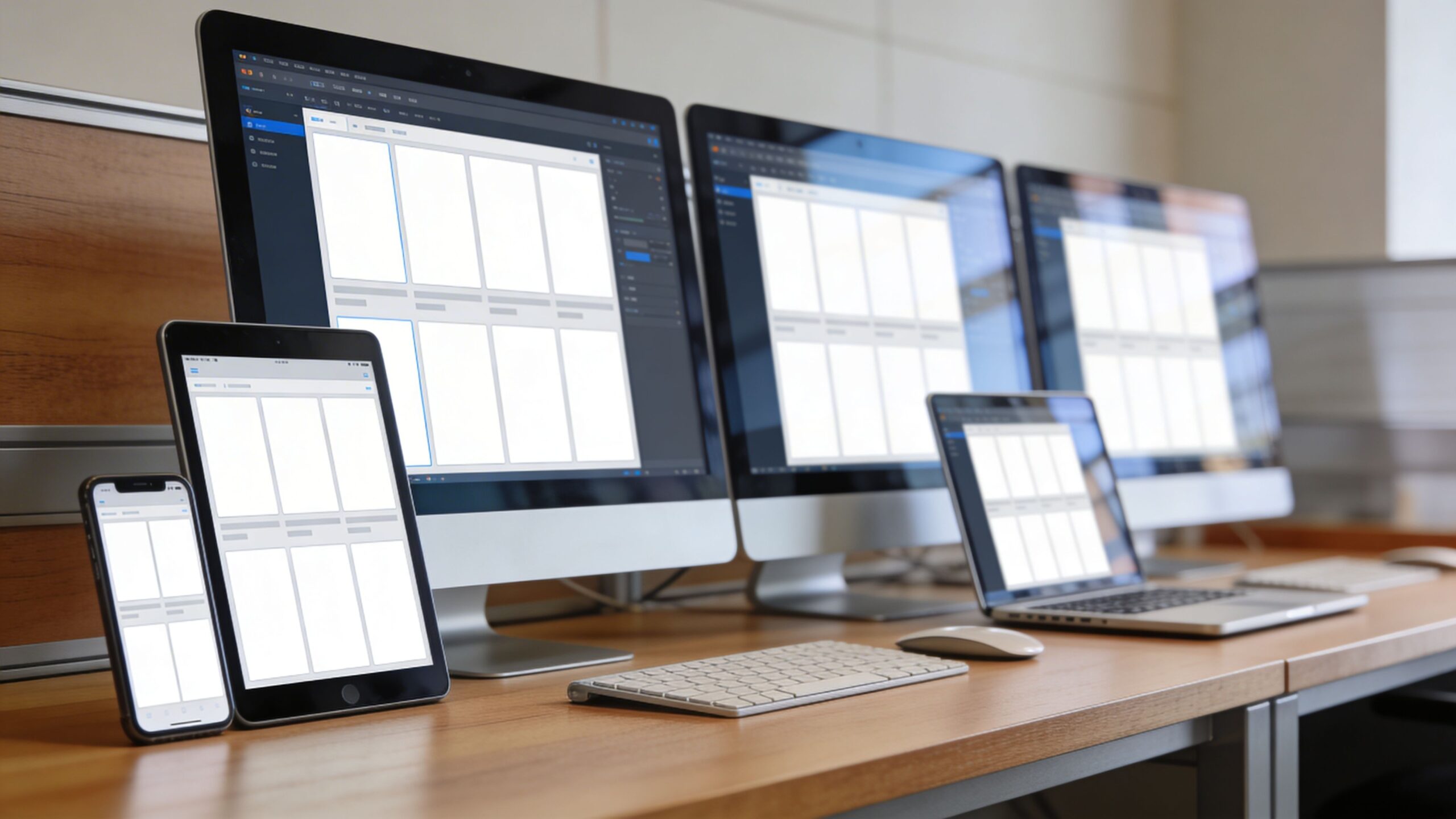
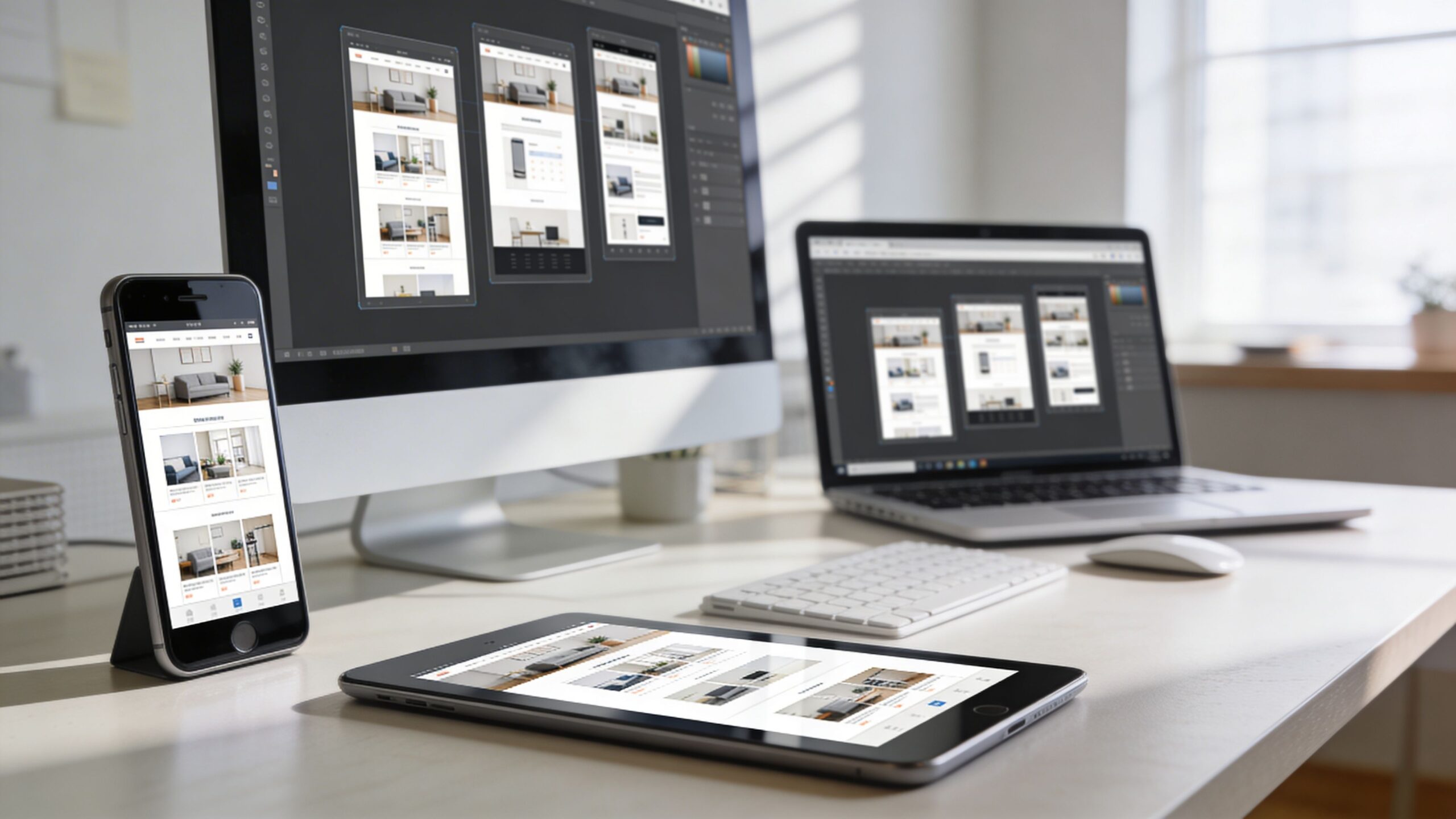
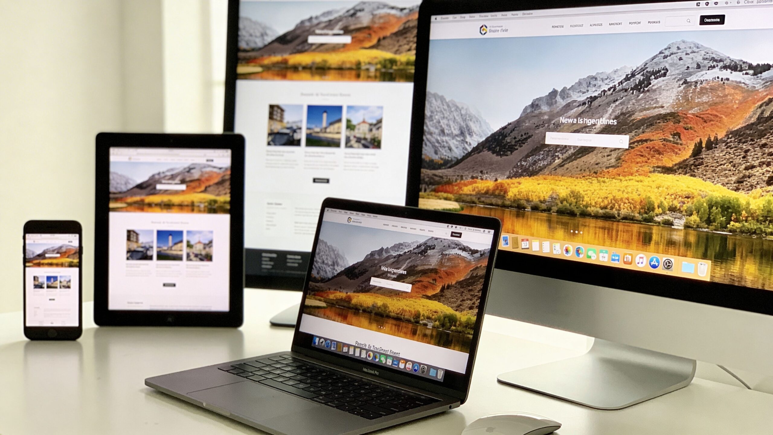
Responsive web design has evolved dramatically over the years, and one of the most powerful tools driving this evolution is Flexbox. Short for Flexible Box Layout, Flexbox offers a modern, efficient way to design responsive layouts that adapt seamlessly across different screen sizes. For developers and designers alike, it has become an essential part of building websites that are both visually appealing and highly functional. Unlike older layout methods that relied on floats or rigid grid systems, Flexbox introduces a more intuitive way to control alignment, spacing, and distribution of elements. It allows containers to dynamically adjust their children, making it easier to create layouts that respond naturally to different devices. Whether you are building a simple navigation bar or a complex multi-section page, Flexbox provides the flexibility needed to create consistent and adaptive designs.
A: Flexbox is a CSS layout method that helps align and distribute items inside a container more efficiently.
A: It makes it easier for rows, columns, and content groups to resize, wrap, and reorganize across different screens.
A: Flexbox is best for one-dimensional layouts, while Grid is better for more complex two-dimensional row-and-column structures.
A: It allows items to move onto new lines when the container gets too narrow, which helps prevent overflow on smaller screens.
A: Yes, that is one of its most popular and useful features.
A: Often for many sections yes, but complete sites may also need media queries, responsive images, and sometimes CSS Grid.
A: Many modern themes, builders, and block plugins use Flexbox or Flexbox-style layout behavior behind the scenes.
A: Yes, because media queries help fine-tune layout shifts, spacing, and stacking at important breakpoints.
A: Forgetting about wrapping, alignment axes, or how flex properties affect available space across different screen sizes.
A: Choose Grid when the layout needs stronger control over both rows and columns at the same time.
Understanding the Core Concept of Flexbox
At its core, Flexbox is built around the idea of a flexible container and its items. When you apply Flexbox to a container, its child elements become flexible items that can be aligned and distributed according to specific rules. This relationship between the container and its items is the foundation of how Flexbox operates.
The container defines the layout behavior, while the items respond to those rules. You can control how items are spaced, how they grow or shrink, and how they align within the container. This level of control allows you to create layouts that adapt dynamically without requiring complex calculations or additional code.
Flexbox operates along two main axes: the main axis and the cross axis. The main axis determines the primary direction of the layout, whether horizontal or vertical, while the cross axis runs perpendicular to it. Understanding these axes is key to mastering Flexbox, as they influence how elements are positioned and aligned.
This model provides a level of precision and flexibility that was difficult to achieve with older layout techniques. It enables developers to create responsive designs that feel natural and intuitive across all devices.
Building Responsive Layouts with Flex Containers
Creating a responsive layout with Flexbox begins with defining a flex container. Once a container is set to use Flexbox, its child elements automatically become part of the flexible layout system. This allows you to control how these elements behave as the screen size changes.
One of the most powerful features of Flexbox is its ability to adjust the direction of content. You can easily switch between horizontal and vertical layouts, making it ideal for responsive design. For example, a row of items on a desktop screen can transform into a stacked column on a mobile device without requiring significant changes to the structure.
Flexbox also makes it simple to manage spacing between elements. Instead of relying on margins or complex positioning, you can use built-in alignment properties to distribute space evenly. This ensures that your layout remains balanced and visually appealing across different screen sizes.
As your layout expands or contracts, Flexbox automatically adjusts the size and position of elements. This dynamic behavior reduces the need for manual adjustments and allows your design to respond naturally to different environments.
Aligning and Distributing Content with Precision
One of the standout features of Flexbox is its ability to align and distribute content with remarkable precision. Whether you need to center elements, space them evenly, or align them along specific axes, Flexbox provides the tools to achieve your desired layout.
Alignment in Flexbox is controlled through properties that define how items are positioned within the container. You can align items along the main axis or the cross axis, depending on your needs. This flexibility allows you to create layouts that are both visually balanced and easy to navigate.
Spacing is another area where Flexbox excels. Instead of manually calculating margins or padding, you can use properties that automatically distribute space between items. This ensures consistency and reduces the likelihood of layout issues.
These alignment and distribution capabilities are particularly useful in responsive design, where layouts must adapt to varying screen sizes. Flexbox allows you to maintain a consistent structure while adjusting the positioning of elements to fit different devices.
Adapting Layouts Across Devices with Flexbox
Flexbox is inherently responsive, making it an ideal choice for modern web design. Its ability to adjust layouts dynamically means that your website can adapt to different screen sizes without requiring extensive modifications.
When combined with media queries, Flexbox becomes even more powerful. Media queries allow you to apply different styles based on the characteristics of the user’s device, such as screen width or orientation. This enables you to create tailored experiences that feel optimized for each environment.
For example, you can use Flexbox to create a multi-column layout for larger screens and then switch to a single-column layout for smaller devices. This ensures that content remains readable and accessible, regardless of the screen size.
Flexbox also supports flexible item sizing, allowing elements to grow or shrink as needed. This ensures that your layout remains balanced and functional, even as the available space changes. By leveraging these capabilities, you can create responsive designs that deliver a seamless user experience across all devices.
Common Flexbox Patterns for Modern Websites
Flexbox is widely used to create a variety of common layout patterns that are essential in modern web design. From navigation bars to card layouts, it provides a versatile framework for building responsive components.
Navigation menus are one of the most common use cases for Flexbox. It allows you to align menu items horizontally on larger screens and stack them vertically on smaller devices. This adaptability ensures that navigation remains accessible and intuitive.
Card layouts are another popular pattern. Flexbox makes it easy to create grids of content that adjust based on the available space. Cards can be arranged in rows or columns, with consistent spacing and alignment.
Flexbox is also effective for centering content, a task that was historically challenging with older layout methods. Whether you need to center a single element or an entire section, Flexbox provides a straightforward solution.
These patterns demonstrate the versatility of Flexbox and its ability to simplify complex layout challenges. By understanding how to implement these patterns, you can create responsive designs that are both functional and visually appealing.
Avoiding Common Pitfalls and Improving Performance
While Flexbox is a powerful tool, it is important to use it thoughtfully to avoid common pitfalls. One of the most frequent issues is overusing Flexbox for layouts that may be better suited to other techniques. While it excels in many scenarios, it is not always the best choice for every situation.
Performance is another consideration. Although Flexbox is generally efficient, complex layouts with many nested containers can impact rendering performance. Keeping your structure simple and avoiding unnecessary nesting can help maintain optimal performance.
It is also important to test your layouts across different devices and browsers. While Flexbox is widely supported, subtle differences in implementation can affect how your design appears. Regular testing ensures that your layout remains consistent and functional.
Understanding the limitations of Flexbox allows you to use it more effectively. By combining it with other layout techniques when appropriate, you can create robust and efficient responsive designs.
Elevating Your Responsive Design Skills with Flexbox
Flexbox has revolutionized the way developers approach responsive web design. Its intuitive model, powerful alignment tools, and inherent flexibility make it an indispensable resource for building modern websites. By mastering Flexbox, you gain the ability to create layouts that adapt seamlessly to any device. You can design with confidence, knowing that your content will remain accessible, visually appealing, and easy to navigate across all screen sizes. As you continue to refine your skills, you will discover new ways to leverage Flexbox in your projects. Its versatility allows for endless possibilities, from simple layouts to complex, dynamic interfaces. Responsive web design is about more than just fitting content onto different screens. It is about creating experiences that feel natural and engaging for every user. With Flexbox as part of your toolkit, you are well-equipped to meet this challenge and build websites that truly stand out in today’s digital landscape.