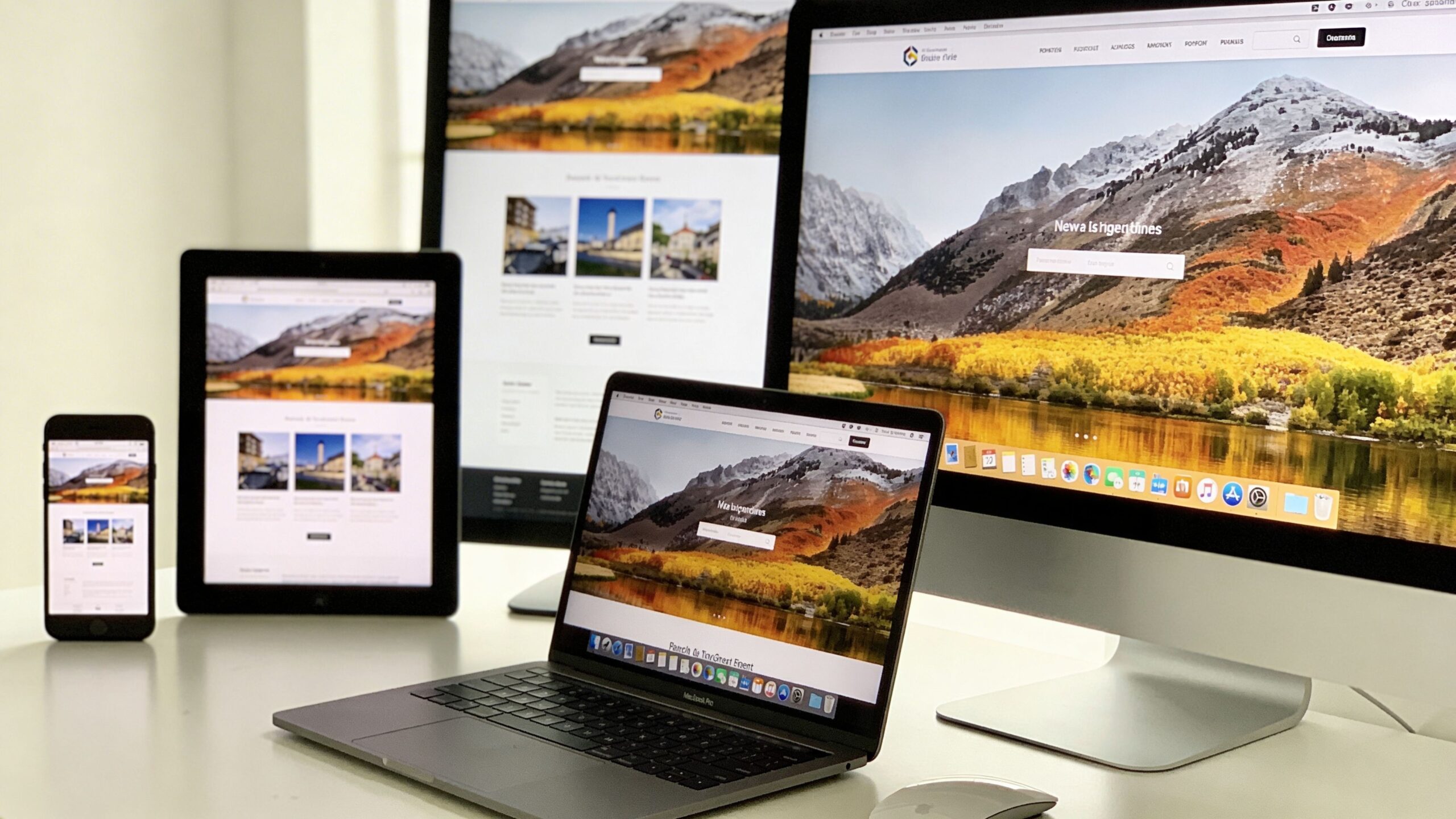
In a world where people browse the internet on everything from smartphones and tablets to ultra-wide desktop monitors, websites can no longer afford to look rigid or outdated. Users expect seamless experiences no matter what device they’re using. This is where responsive web design comes into play. It’s not just a trend—it’s a foundational approach that ensures websites adapt fluidly to different screen sizes, resolutions, and user behaviors. For beginners stepping into the world of web development or digital design, understanding responsive web design is one of the most valuable skills you can develop. Responsive web design, often abbreviated as RWD, is the practice of building websites that automatically adjust their layout, images, and functionality based on the screen size and orientation of the device being used. Instead of creating separate websites for mobile and desktop users, responsive design allows a single website to dynamically adapt to all environments. This approach not only simplifies development but also improves usability, performance, and search engine visibility.
A: It is a design approach that makes a website adapt to different screen sizes and devices.
A: Yes, because visitors use many devices and a poor mobile experience can hurt engagement and SEO.
A: Usually no; a well-built responsive site can serve desktop, tablet, and mobile users from one setup.
A: It is the screen width where your layout changes to better fit the available space.
A: It means designing for smaller screens first, then expanding the design for larger ones.
A: They may have fixed widths, poor scaling rules, or containers that do not adapt properly.
A: Yes, many modern themes include built-in responsive layouts and styling.
A: Not automatically, but good responsive practices often go together with better optimization and performance.
A: Use browser developer tools, preview modes in builders, and real phones or tablets whenever possible.
A: Assuming a site is responsive just because it shrinks, instead of checking usability, spacing, readability, and navigation.
The Evolution of Web Design: From Fixed to Fluid
To fully appreciate responsive web design, it helps to understand how websites have evolved. In the early days of the internet, most websites were built with fixed layouts. Designers assumed users would access content from desktop computers with similar screen sizes, so pages were created with rigid dimensions. These designs often broke when viewed on smaller screens, forcing users to zoom in, scroll horizontally, or abandon the site altogether.
As mobile devices became more popular, developers initially responded by creating separate mobile versions of websites. While this solved some usability issues, it introduced new challenges such as duplicated content, increased maintenance, and inconsistent user experiences. Managing multiple versions of the same site quickly became inefficient.
Responsive web design emerged as a solution to these problems. Instead of building multiple versions, developers began using flexible grids, fluid images, and media queries to create layouts that adapt automatically. This shift marked a turning point in web design, aligning it more closely with the diverse ways people interact with digital content today.
The Core Principles Behind Responsive Web Design
At its core, responsive web design relies on a few key principles that work together to create a flexible and adaptive experience. These principles are simple in concept but powerful in execution.
The first principle is fluid grids. Instead of using fixed pixel-based layouts, responsive design uses relative units like percentages. This allows elements on the page to scale proportionally based on the screen size. As a result, content maintains its structure and readability across devices.
The second principle is flexible images and media. Images are designed to scale within their containing elements, ensuring they don’t overflow or distort on smaller screens. This is typically achieved using CSS techniques that allow images to resize dynamically.
The third principle is media queries. These are CSS rules that apply different styles depending on the characteristics of the device, such as screen width, height, or orientation. Media queries enable designers to create breakpoints where the layout adjusts to provide the best possible user experience.
Together, these principles form the foundation of responsive web design, allowing websites to adapt seamlessly to a wide range of devices.
Why Responsive Web Design Matters More Than Ever
Responsive web design is not just a technical concept—it’s a critical factor in how users interact with your website and how search engines evaluate it. In today’s mobile-first world, more than half of all web traffic comes from mobile devices. If your site doesn’t perform well on smaller screens, you risk losing a significant portion of your audience.
User experience is one of the biggest reasons responsive design matters. A website that is easy to navigate, read, and interact with on any device creates a positive impression and encourages users to stay longer. On the other hand, a poorly optimized site can frustrate users and drive them away within seconds.
Search engine optimization also plays a major role. Search engines prioritize mobile-friendly websites in their rankings, meaning responsive design can directly impact your visibility online. A responsive site typically has faster load times, lower bounce rates, and better engagement metrics—all of which contribute to improved SEO performance.
From a business perspective, responsive design reduces development and maintenance costs. Instead of managing multiple versions of a site, you can focus on a single, unified experience. This efficiency allows for faster updates, consistent branding, and better long-term scalability.
How Responsive Web Design Actually Works
Understanding how responsive web design works behind the scenes can demystify the process and make it more approachable for beginners. At a high level, it involves a combination of HTML structure and CSS styling that responds to the user’s device.
When a user visits a responsive website, the browser reads the code and determines the device’s screen size and capabilities. Based on this information, the site applies different styles using media queries. For example, a three-column layout on a desktop might transform into a single-column layout on a smartphone, making the content easier to read and navigate.
Typography also adjusts to improve readability. Font sizes, line spacing, and margins are optimized for different screen sizes, ensuring that text remains clear and accessible. Navigation menus often change as well, transitioning from horizontal menus on larger screens to collapsible menus on smaller devices.
Images and other media elements are scaled and repositioned to fit the available space. This ensures that visual content remains impactful without overwhelming the layout. The end result is a cohesive experience that feels tailored to each device, even though it’s powered by a single codebase.
Common Breakpoints and Device Considerations
While responsive design is meant to be flexible, developers often use breakpoints to define where significant layout changes occur. Breakpoints are specific screen widths at which the design adapts to provide a better user experience.
Common breakpoints typically correspond to categories like smartphones, tablets, and desktops. For example, a breakpoint might be set around 768 pixels to target tablets, while another might be set around 1024 pixels for larger screens. However, modern responsive design focuses less on specific devices and more on the content itself. The goal is to ensure that the layout works well at any size, not just predefined categories.
Device considerations go beyond screen size. Factors like touch interaction, screen orientation, and performance capabilities also influence design decisions. For instance, buttons need to be large enough for touch input, and animations should be optimized to avoid slowing down the experience on less powerful devices.
By considering these factors, responsive design creates a more inclusive and user-friendly experience for a diverse audience.
Tools and Technologies That Power Responsive Design
Responsive web design is supported by a wide range of tools and technologies that make implementation more efficient and accessible. Modern web development frameworks often include built-in features for responsive design, allowing developers to create adaptive layouts with less effort.
CSS frameworks like Bootstrap and Tailwind CSS provide pre-designed components and grid systems that simplify the process of building responsive layouts. These frameworks include responsive utilities that automatically adjust styles based on screen size, making them especially useful for beginners.
Web browsers also offer powerful developer tools that allow you to test how your site looks on different devices. These tools simulate various screen sizes and resolutions, helping you identify and fix issues before they affect real users.
In addition to frameworks and tools, responsive design relies on best practices such as mobile-first design. This approach involves designing for the smallest screen first and then progressively enhancing the layout for larger screens. By starting with mobile, you ensure that the core experience is optimized for the most constrained environment.
Common Mistakes Beginners Should Avoid
While responsive web design offers many benefits, beginners often encounter challenges when implementing it for the first time. One common mistake is relying too heavily on fixed dimensions. Using pixels instead of relative units can lead to layouts that don’t adapt properly to different screen sizes.
Another mistake is neglecting performance. Large images, excessive animations, and unoptimized code can slow down your site, especially on mobile devices. Responsive design should prioritize speed and efficiency to provide a smooth user experience.
Navigation can also be a challenge. Complex menus that work well on desktops may become difficult to use on smaller screens. Simplifying navigation and using intuitive design patterns can help improve usability.
Testing is another critical area. Failing to test your site on multiple devices and screen sizes can result in overlooked issues that affect real users. Regular testing ensures that your design performs consistently across different environments.
By being aware of these common pitfalls, beginners can build more effective and user-friendly responsive websites.
The Future of Responsive Web Design
Responsive web design continues to evolve as technology advances and user expectations change. New devices, screen sizes, and interaction methods are constantly emerging, pushing designers to think beyond traditional boundaries. One of the most exciting developments is the rise of adaptive and context-aware design. These approaches go beyond screen size, considering factors like user behavior, location, and device capabilities to create more personalized experiences. Advancements in CSS, such as container queries, are also expanding the possibilities of responsive design. These features allow elements to adapt based on their parent containers rather than the entire viewport, providing greater flexibility and precision. As the digital landscape becomes more complex, responsive web design remains a cornerstone of modern web development. It ensures that websites are accessible, efficient, and engaging for users around the world, regardless of how they choose to connect. For beginners, mastering responsive web design is more than just learning a technique—it’s embracing a mindset that prioritizes adaptability, user experience, and innovation. It’s about building websites that don’t just exist, but thrive in a constantly changing digital environment.